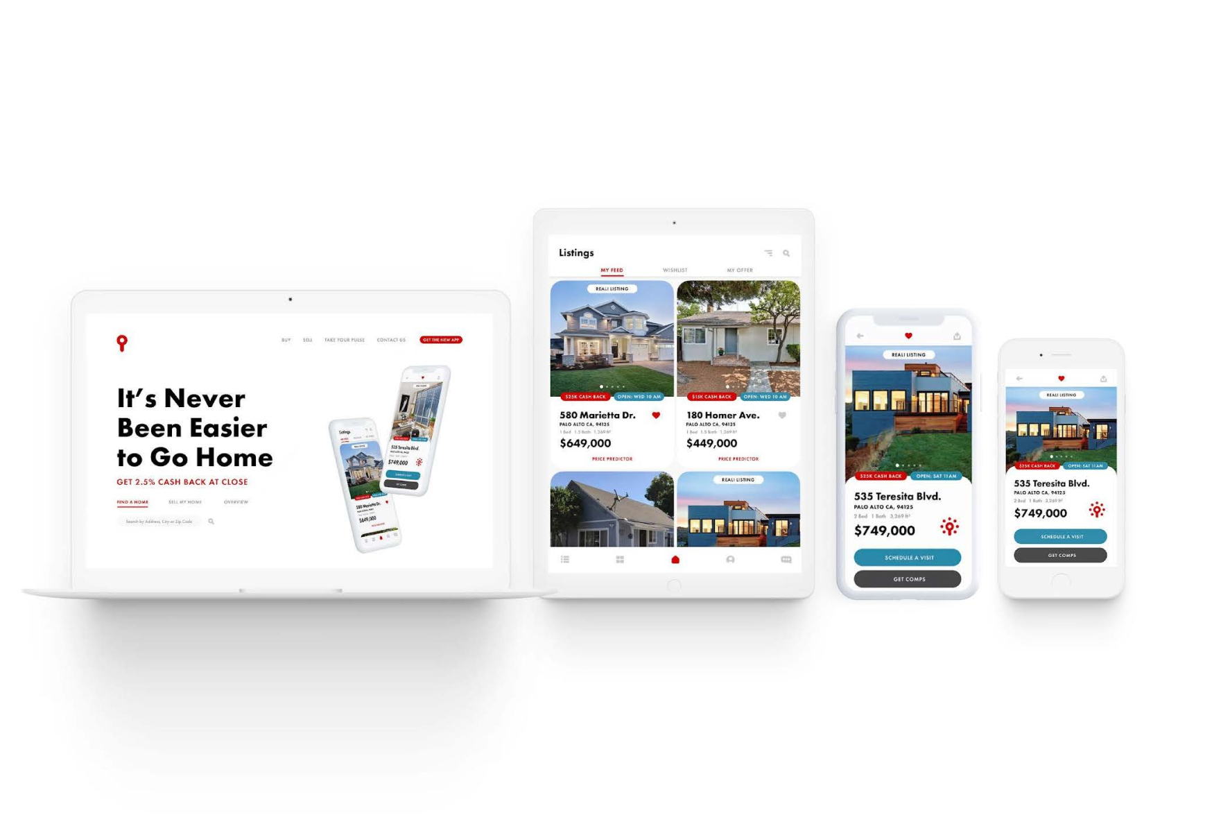
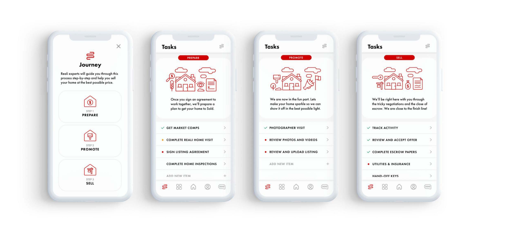
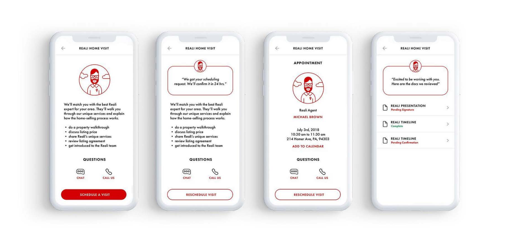
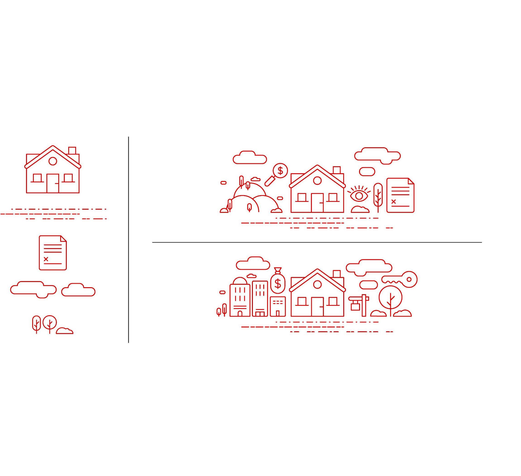
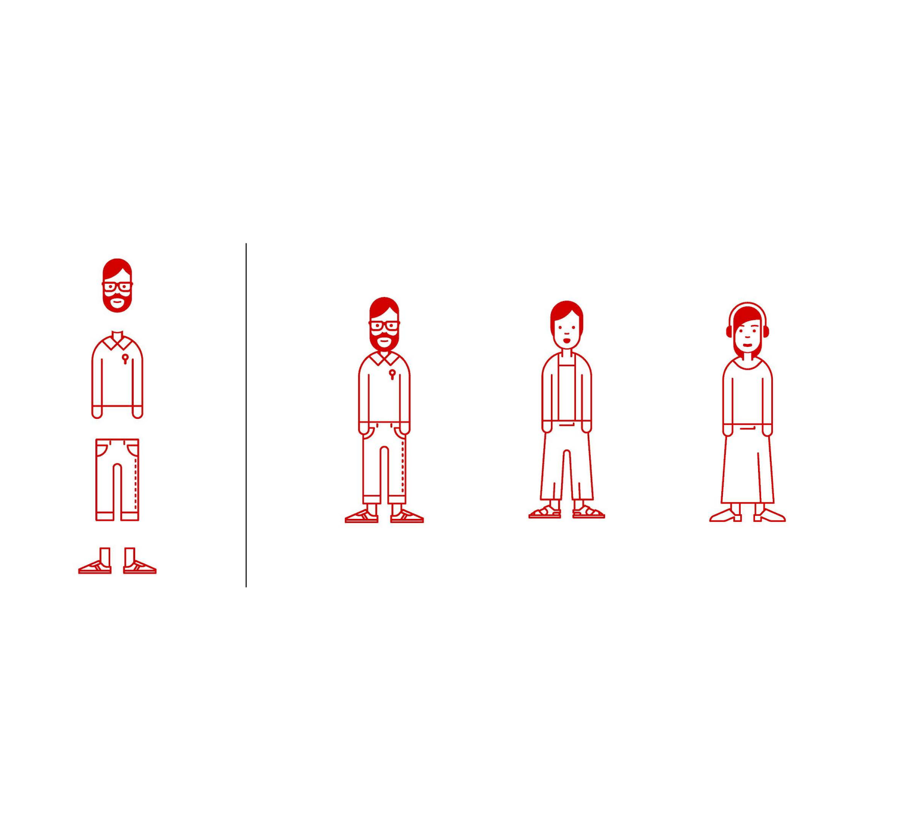
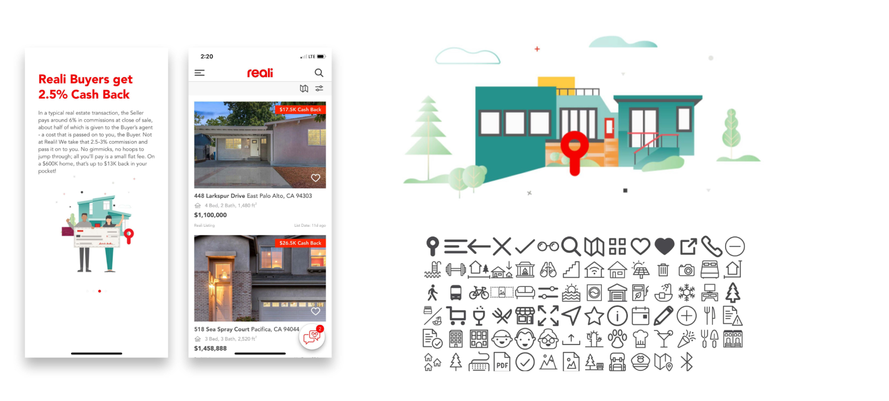
The Background
The real estate market can be tumultuous, and the companies that exist within that market have to be competitive in order to succeed. Reali found that their digital experience was lacking that competitive edge and turned to Idean for a brand redesign. The new branding had to be supported with UX updates to create an all-around improved home shopping experience.
The Creative Direction
Seek out the value in the brand elements that are available and bring the richest parts of them to the foreground. The end result needed to feel fresh, and yet remember where it came from.
Timeline
4 weeks for UX Design
2 weeks for Illustration
Role
Visual Designer,
Illustrator
Skills
Art Direction, 

Branding,
Illustration,
UI Design
Client
It starts with research and understanding
Before
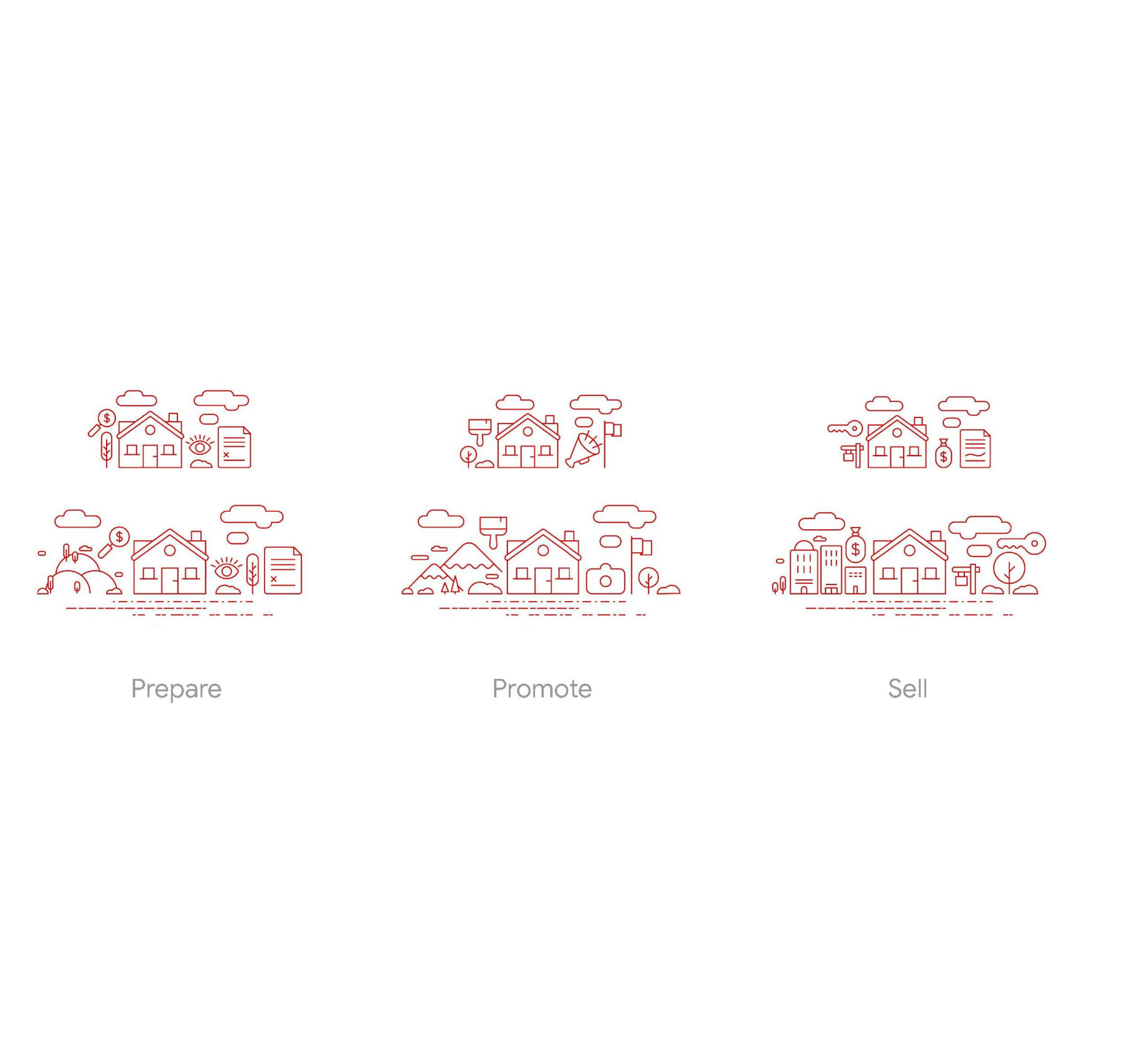
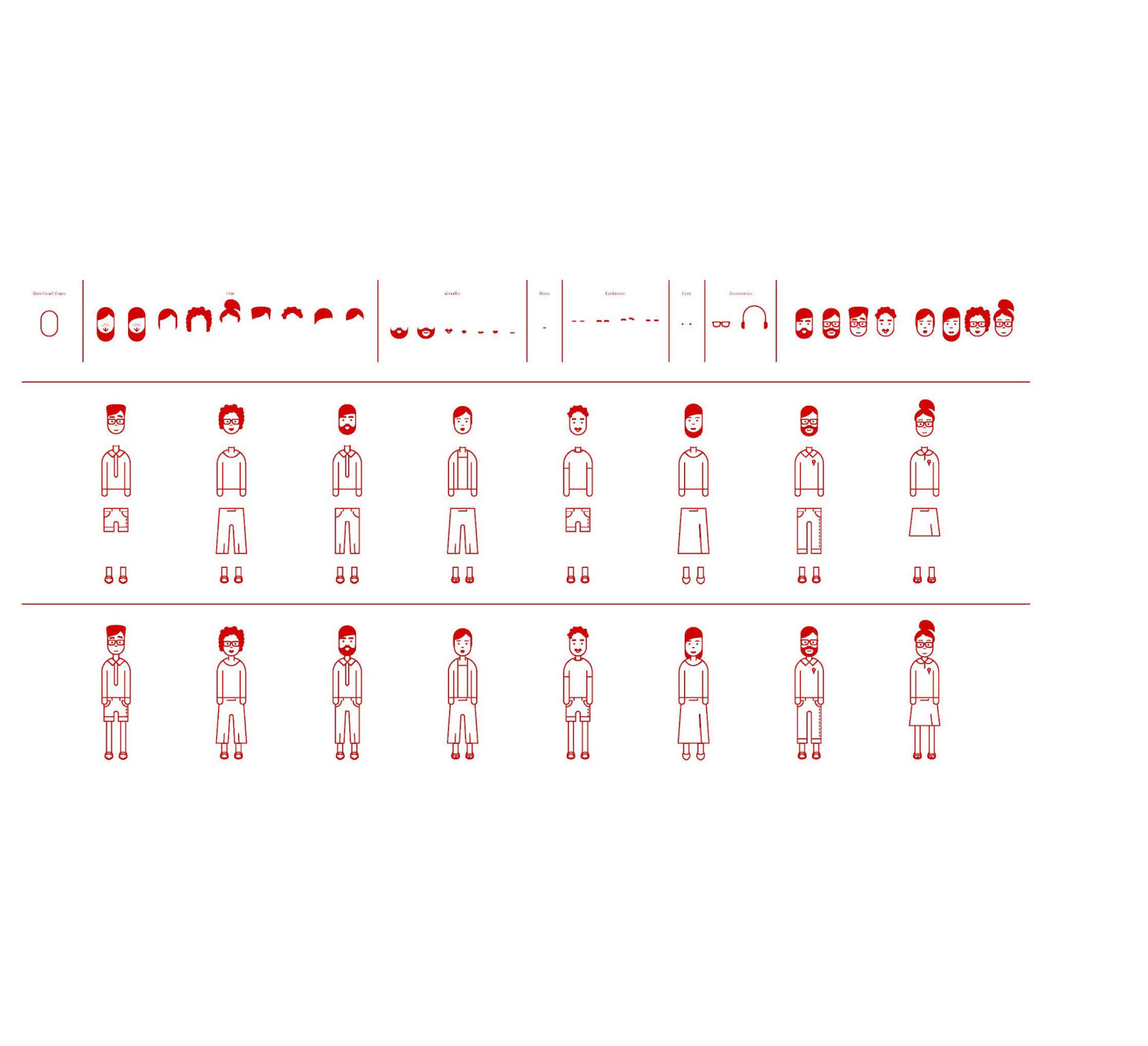
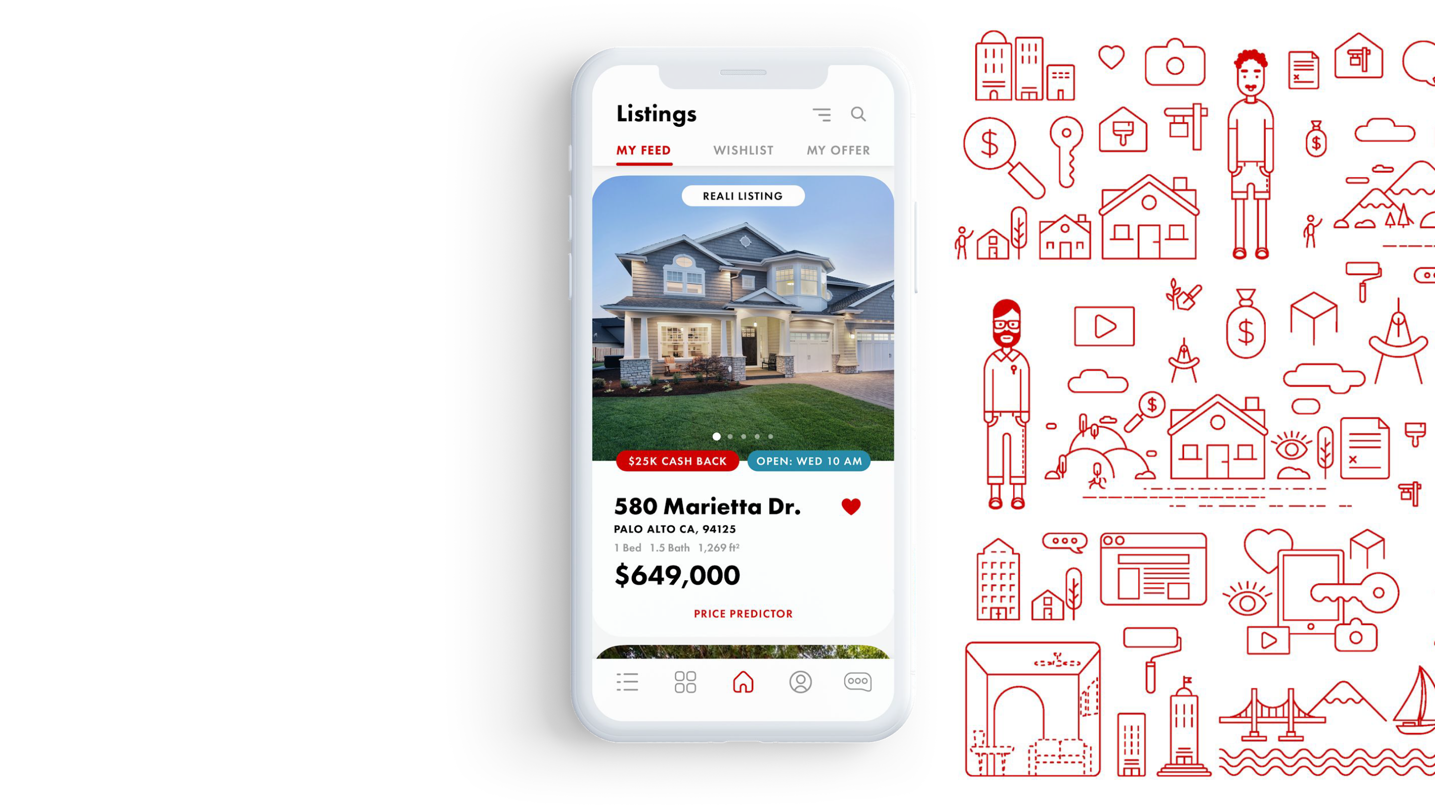
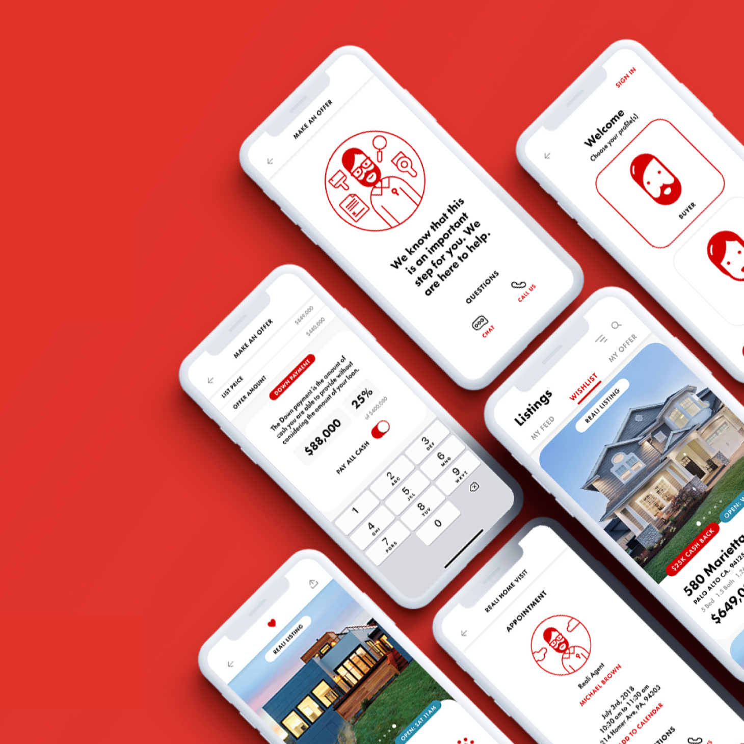
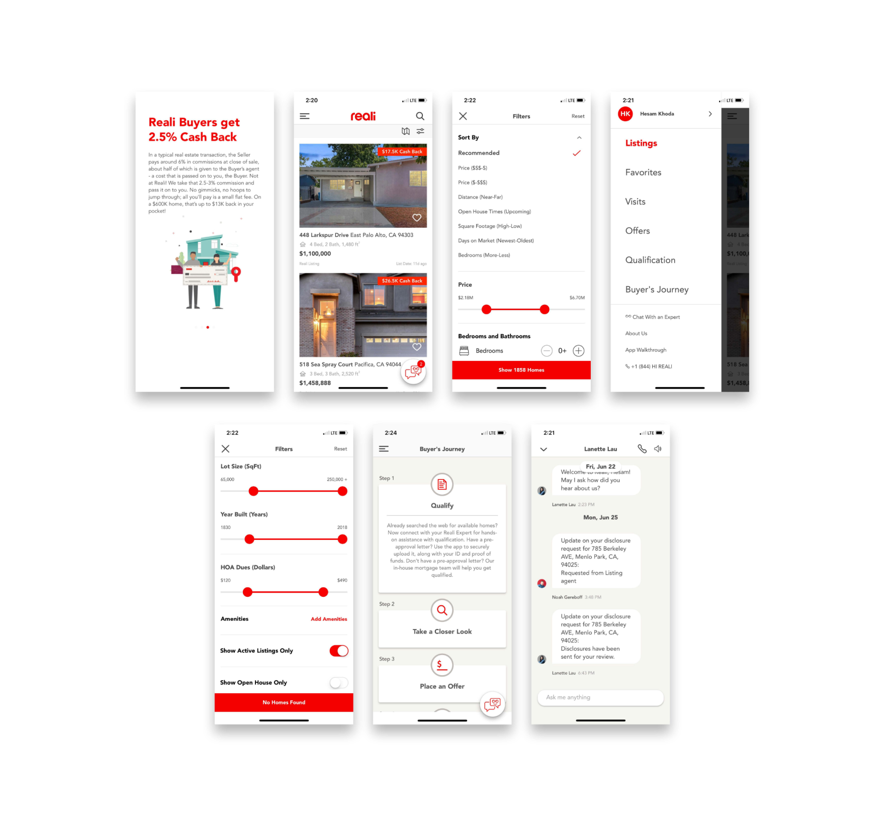
The aim of the project was to redesign the brand look and feel of the app with updates to the experience, so the first thing we did as a team was to look at what was broken.
The previous visual style was not only very limited, but also disparate and broken in the way that the shapes spoke to each other. The icons had various line weights, and had no decisiveness around round or squared cap styles. The icons also did not fit the weight of the typeface in use, and the illustration style felt dated.
The previous mobile design lacked intrigue and failed to compete with the experiences other real estate companies were offering.

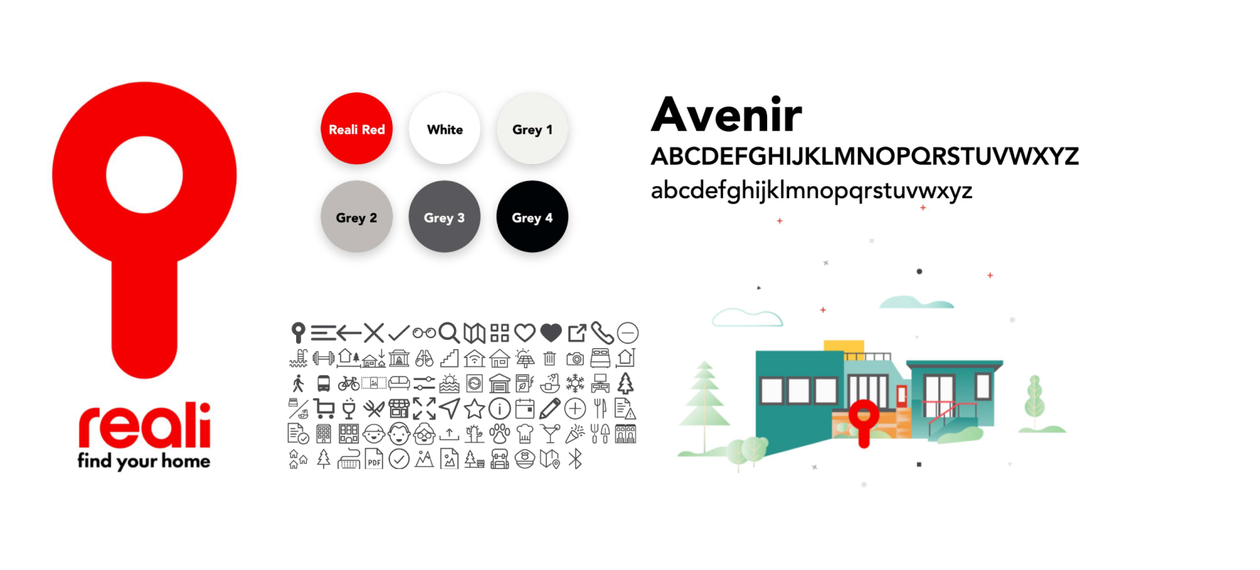
Good design is as little design as possible.

Less, but better - because it concentrates on the essential aspects, and the products are not burdened with non-essentials. Back to purity, back to simplicity.

—Dieter Rams

The brand
I focused on what was good about the original brand to start. Simple is smart. It can be difficult to use just a few elements, but once we decode that we can challenge each aspect to work together.
A New POV
The brand is the most valuable asset of the company. Currently, the Reali icon has a history, a meaning, and a powerful message. Let's use that to create a story. It can be simple yet significant.
Taking advantage of the simplicity in the logo can leverage recognizable shapes to use as a language throughout the app.
The details
The previous visual territory hadn’t been implemented consistently and lacked clarity. I made a goal to find a way to make it work in any environment. It didn’t matter if was print or digital. The implementation needed to be clear and cohesive through any platform and didn’t create differences between them. We can feel the personality and character of the main icon. Translating those elements into a visual language I would be able to build components that related to each other.
Using a Similar Design DNA
This basic design language created in these initial shapes became the foundation for the new system. A system that could enable the brand to flex and grow. Here is an example of how each graphic element identifies with each other and work to improve the overall consistency of the brand.
From there we can build a flexible system
Flexibility
Reali took note of what platforms performed best for them and found that mobile had the highest bounce rate. Given that data, we focused on refining the mobile experience first. While the timeline for this project limited the work to mobile alone, we still considered that the new design language would have to be flexible enough to work across platforms.
Icons
Considering the range of flexibility needed, I revisited the iconography to develop the set into something that worked well at a small scale but had the opportunity for growth in other situations.
Typography
Recreating the experience started with essentials such as typography to match the new icon set I was developing. I matched the visual weight of the icons using Futura Standard in a few weights as needed situationally.
UI Design
This design language informed the way that the lead visual designer and I built the buttons and UI within the new experience. We acknowledged the rounded edges and stroke caps in cards and image masks as well.
Screens
Combining all of these elements enabled us to tell a story with a fresh new look that kept a feeling of lightness as the user discovered their new home.
Illustration
Apart from the iconography, there were various other illustration needs in order to create the user experience that we wanted to provide with the redesigned brand and app. These illustrations needed to describe a place to live and make people feel like they belonged there.
Housing
The first primary need for illustration was to represent housing, the subject matter that the brand dealt with entirely. I wanted to show a diverse range of neighborhoods and housing options in a way that felt human, friendly, and light.
Atomic design
Building the conceptual environments began with an atomic approach. Creating pieces of illustrations that could be assembled like Lego blocks would enable me to build consistently while moving faster in order to stay on top of our tight deadline.
Keeping the atomic design system in mind as well as the new design language that I developed, I focused in on creating various houses, and neighborhood structures. These would be the focal point of most illustrations.
Substance
Combining these environment elements with other conceptual icons allowed me to create purposeful scenery that could be more descriptive.
Scaling
Another area that I felt was important to build for was the scaling of illustrations. I made sure to keep consistency at multiple levels and keep shapes recognizable. I focused on locking on to silhouettes that worked at a small scale and built them up with more detail as they increased in size for different purposes.
Characters
In order for users to connect with the new app experience, it was critical to show people living in the neighborhoods. I continued to use the atomic design methods used in the neighborhood designs to build characters systematically to save time under constraints.
Diversity
Diversity and inclusion were of paramount importance in order to give users the ability to see themselves in the neighborhoods we were describing. I wanted people to feel that they belong in the new home that they are seeking.

I created various facial and body part elements that could be assembled like a paper doll to create 2,300+ newer variations of people.
The End Product
In the end, we were able to move swiftly and intelligently to produce a new brand look and product redesign within only a few weeks. The stakeholders were pleased to see that the redesign sparked an increase in app downloads and new site visitors.
The End Product
In the end, we were able to move swiftly and intelligently to produce a new brand look and product redesign within only a few weeks. The stakeholders were pleased to see that the redesign sparked an increase in app downloads and new site visitors.